Time Frame: 2019
Objective: Create a complete visual and brand identity for a fictional company based on a prompt.
Background / About: The prompt that I was given was a furniture company targeted to seniors 60-80 years old, living in 1970's American Southwest. For my references I used my experience living in Arizona and my mom's experience, growing up in the 1970's and being in my company demographic's age bracket.
This project was broken in to sections throughout the semester: 1. promote, 2. Educate, 3. Confront, 4. Sustain and Entertain, 5. brand book
Click on any image to expand to lightbox view.
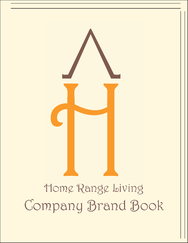
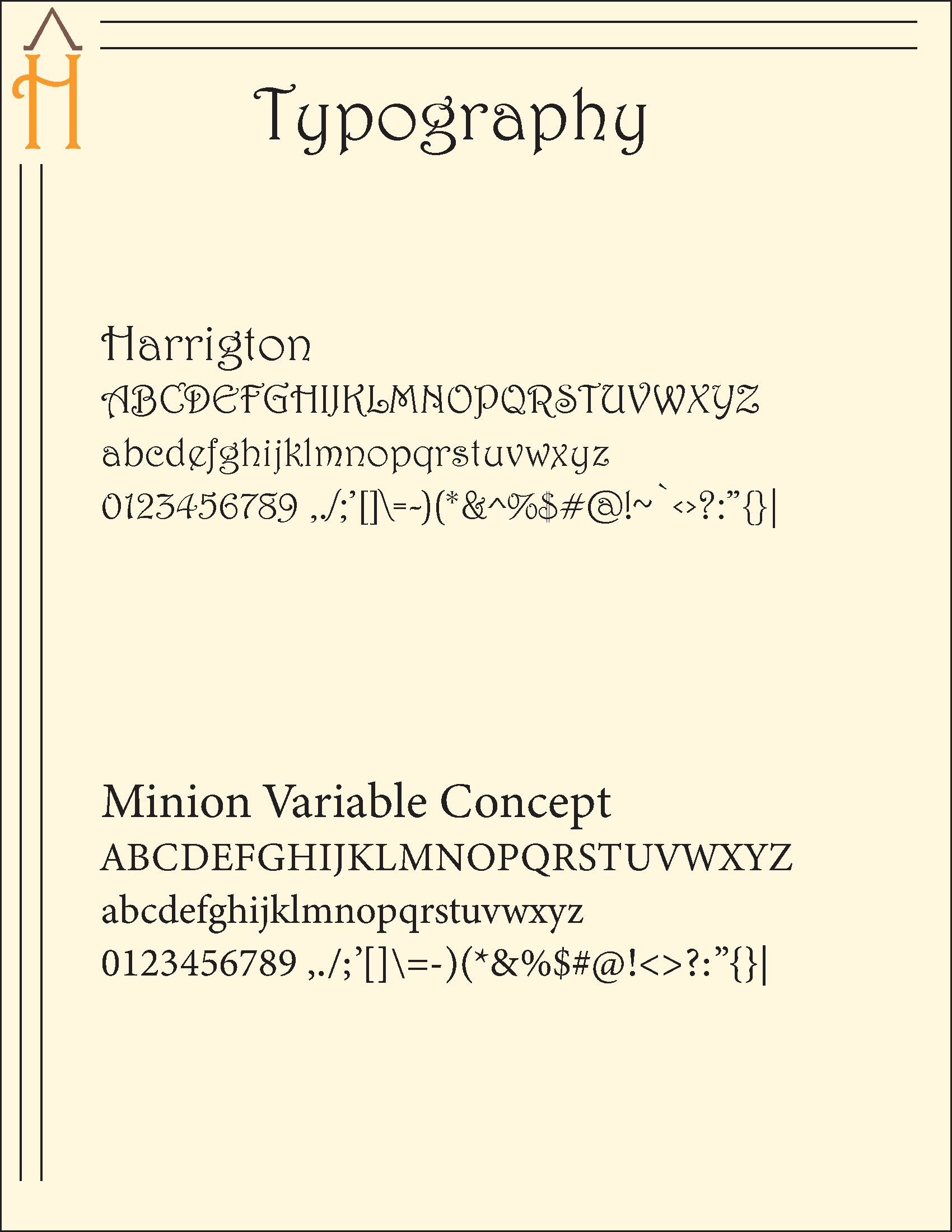
This first section was used to create the name, logo and a cooperate stationary set. The idea for the name of "Home Range Living" came to me as I thought about the many ranches that are in the deserts of the American Southwest; a play on the term "home on the range". I took design trends of the 1970's and elements of the American desert. We presented our inital ideas for critique and went through a few more rounds of critiques to determine our final design.
Initial ideas for company logo
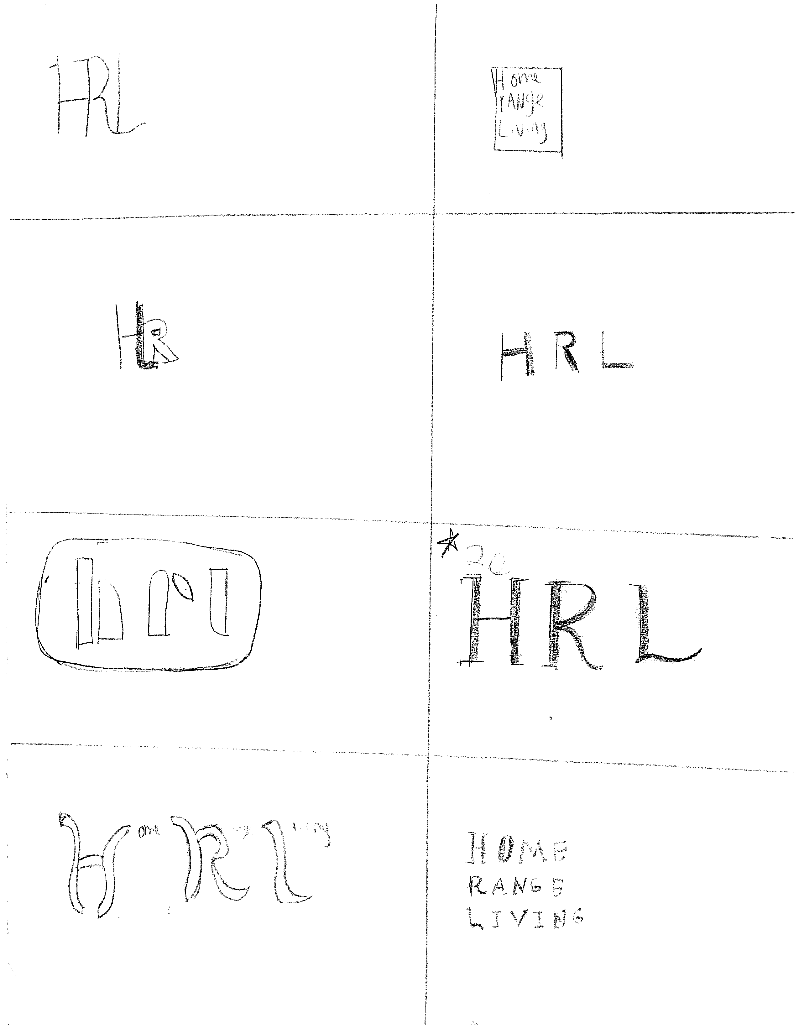
Initial ideas for company logo
Initial ideas for company logo
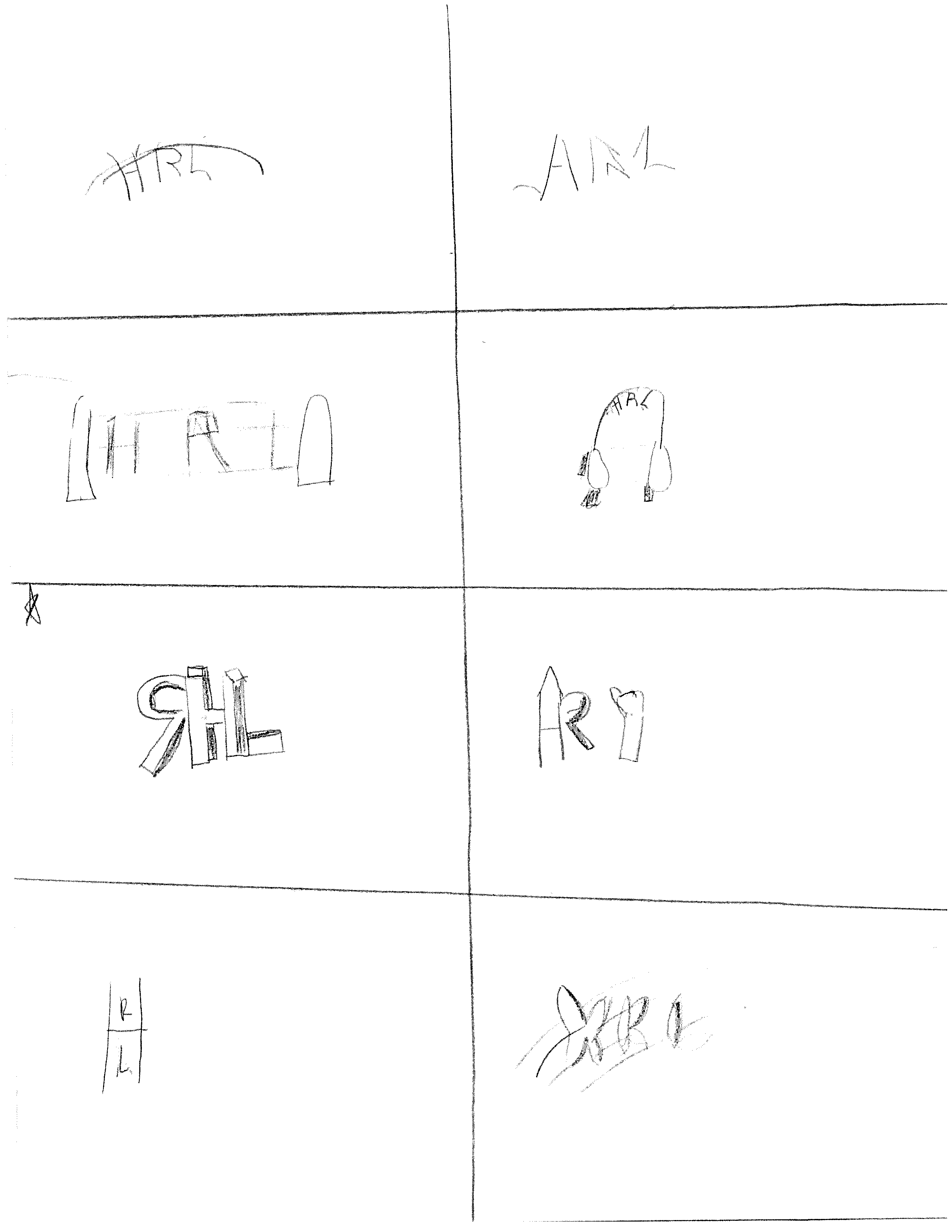
Fine tuning the final company logo

Fine tuning the final company logo

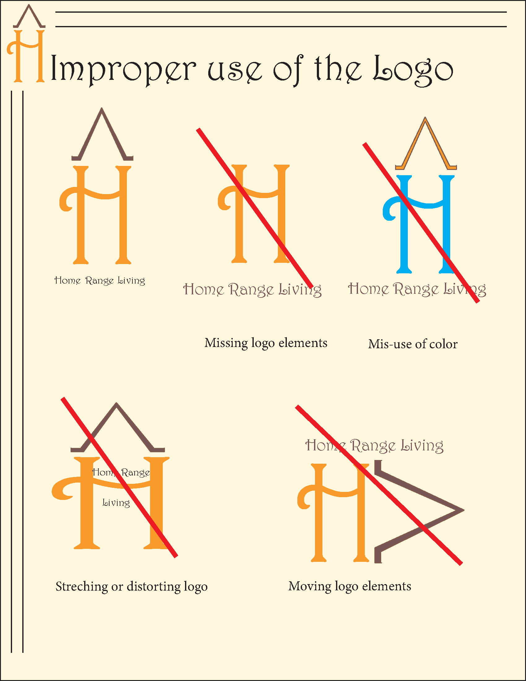
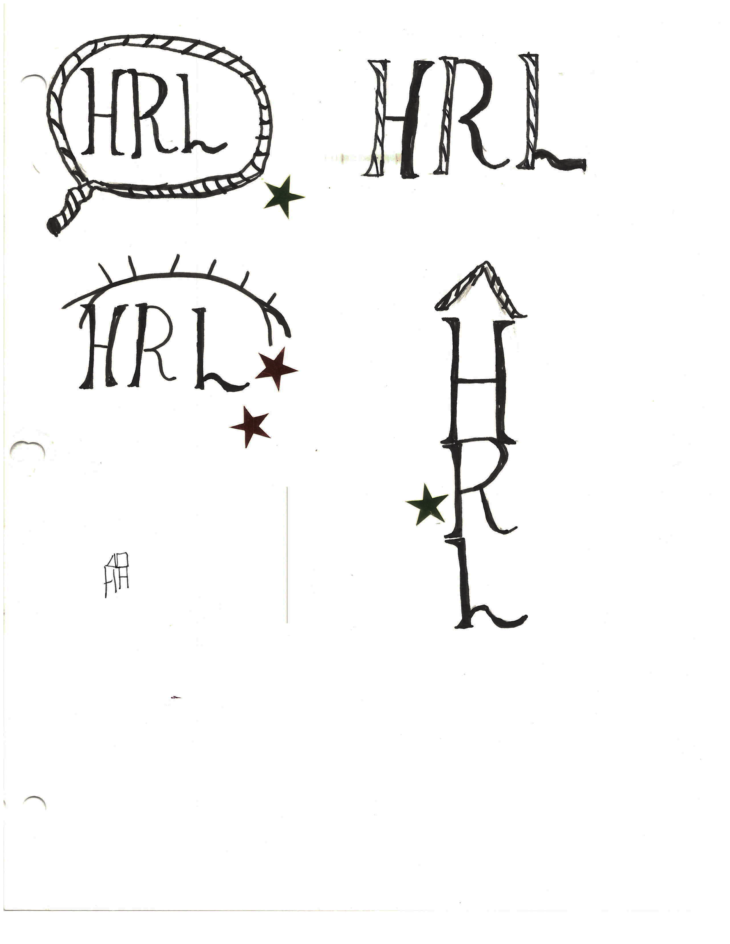
Fine tuning the company logo- final designs
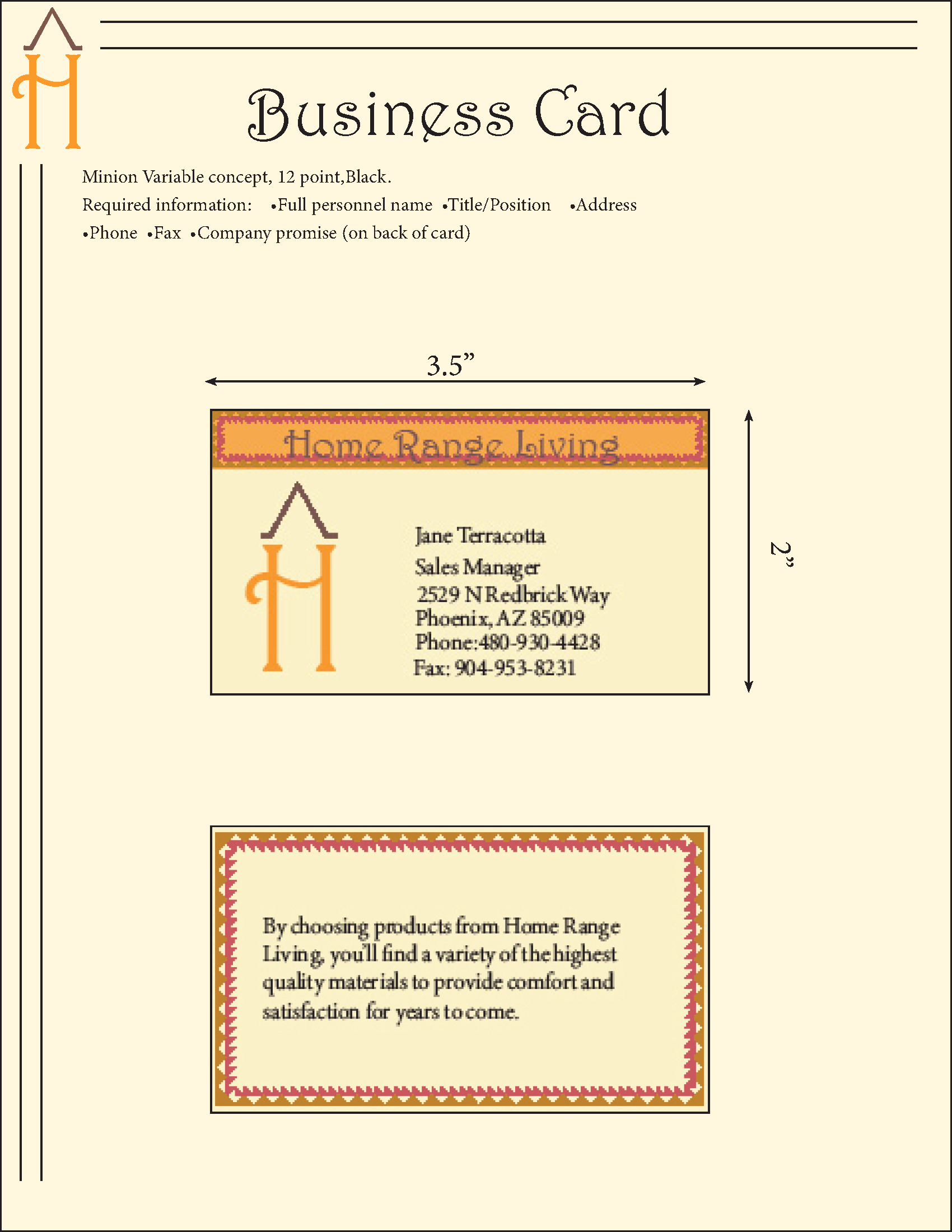
Final business Card
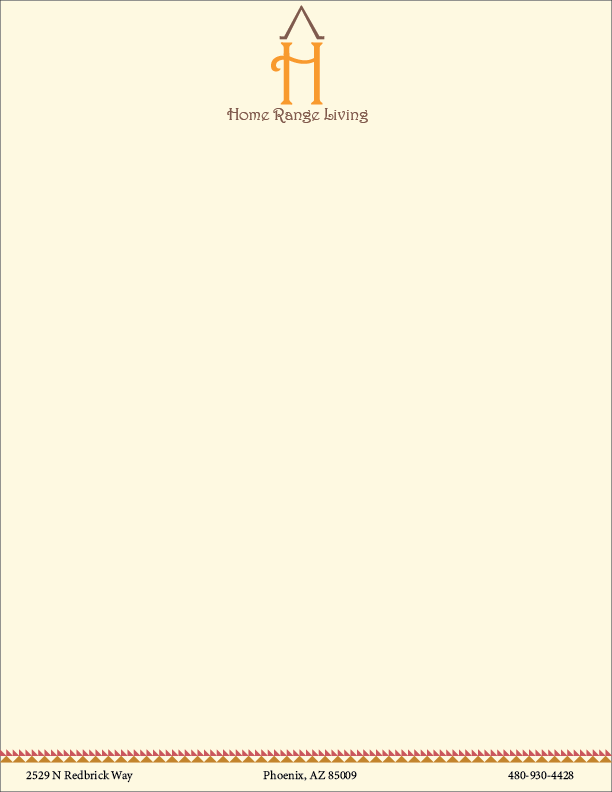
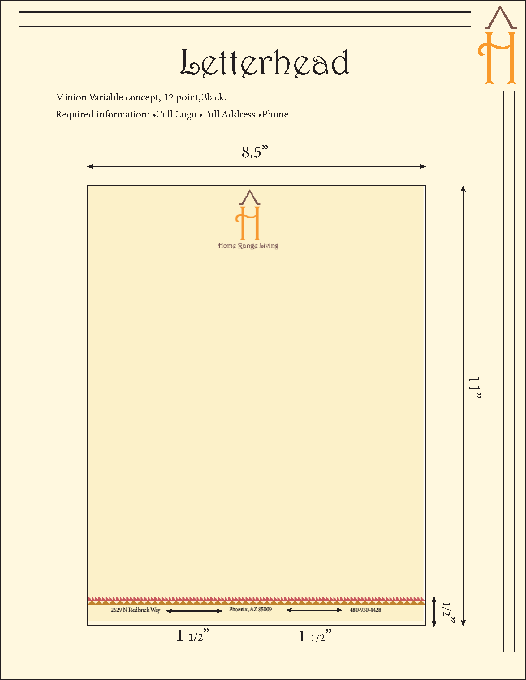
Final letterhead

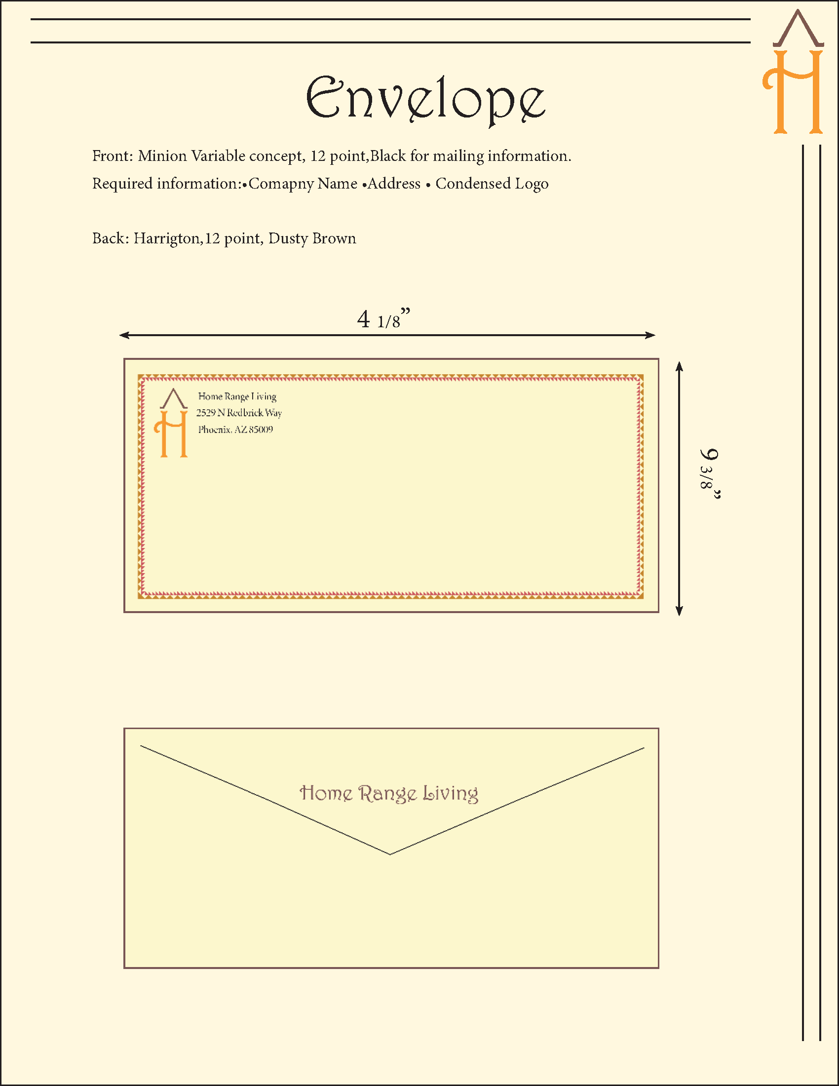
Final envelope
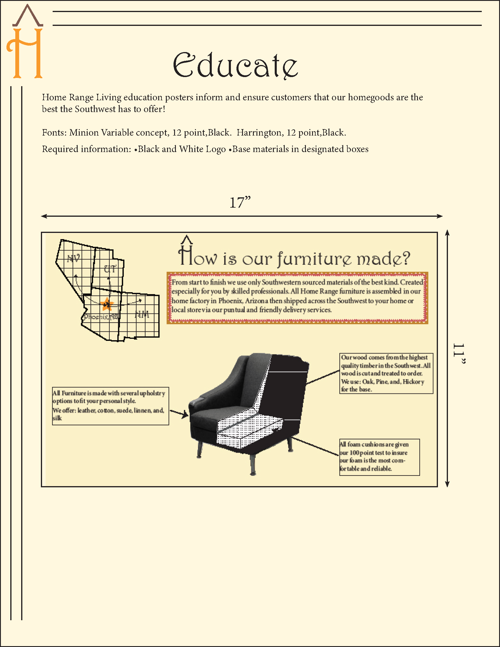
The next section was educate. The goal of this section was to inform and educate our "customers" of our brand and what our company created. As my company created and sold furniture, I wanted to create an infographic that was straight to the point but also gave a professional and trustworthy impression. I reused the border from the stationary suite to hightlight the main text and used diagrams to create a quick understanding.
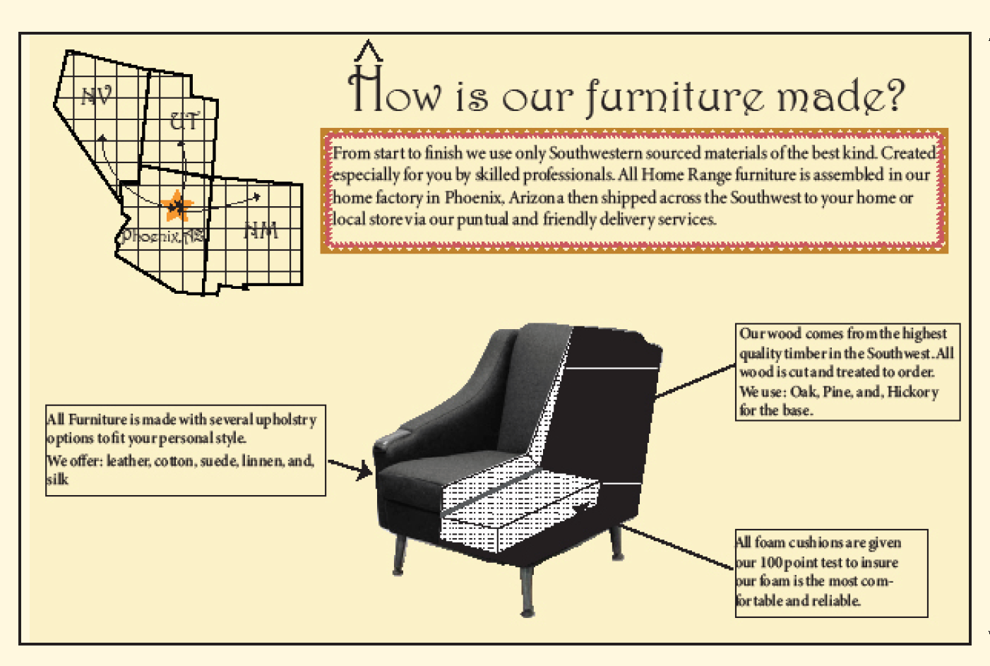
Infographic created to educate how and where the furniture is made.
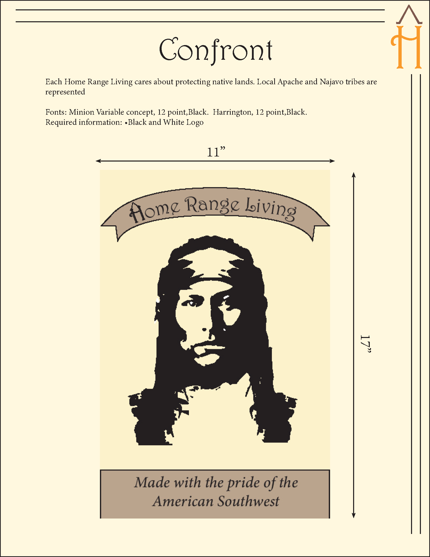
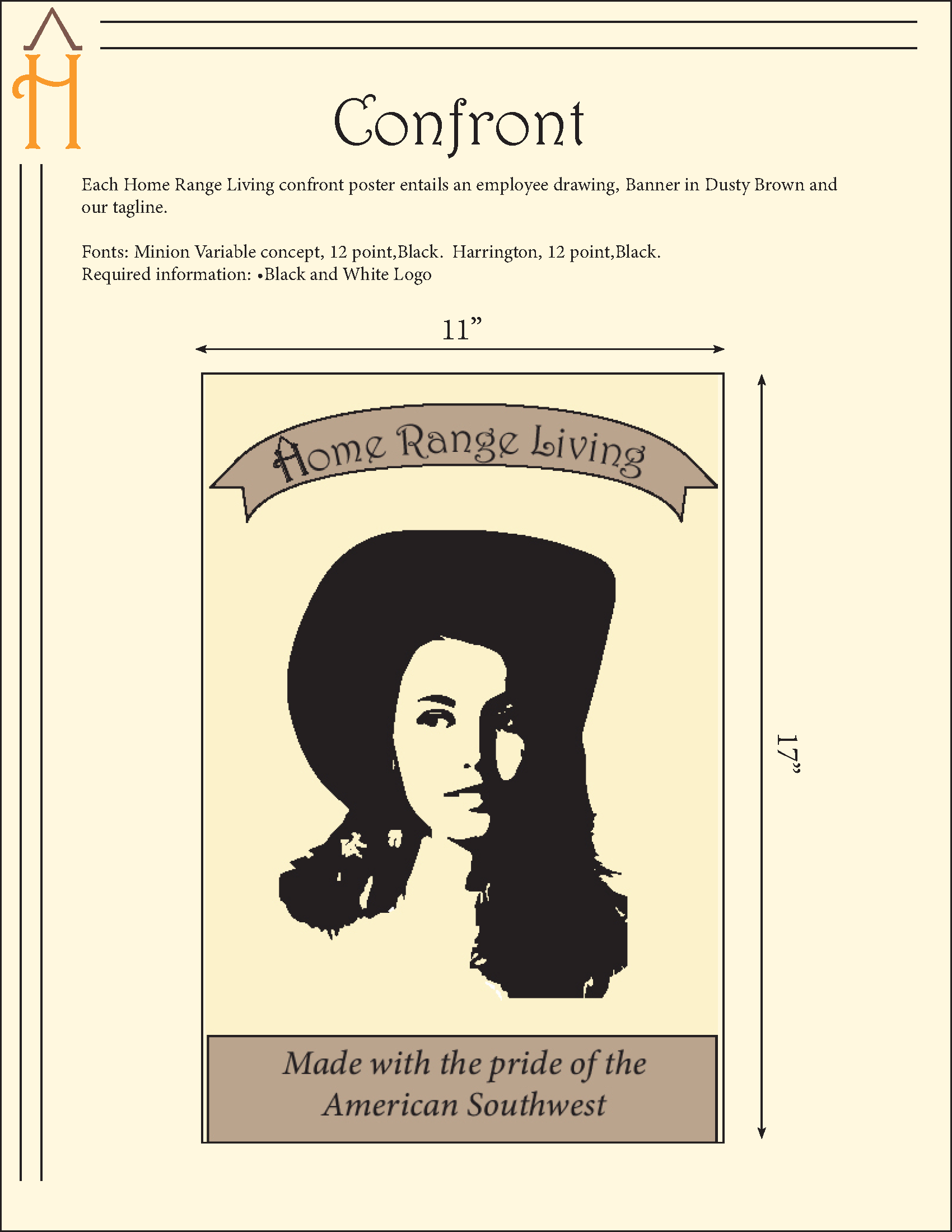
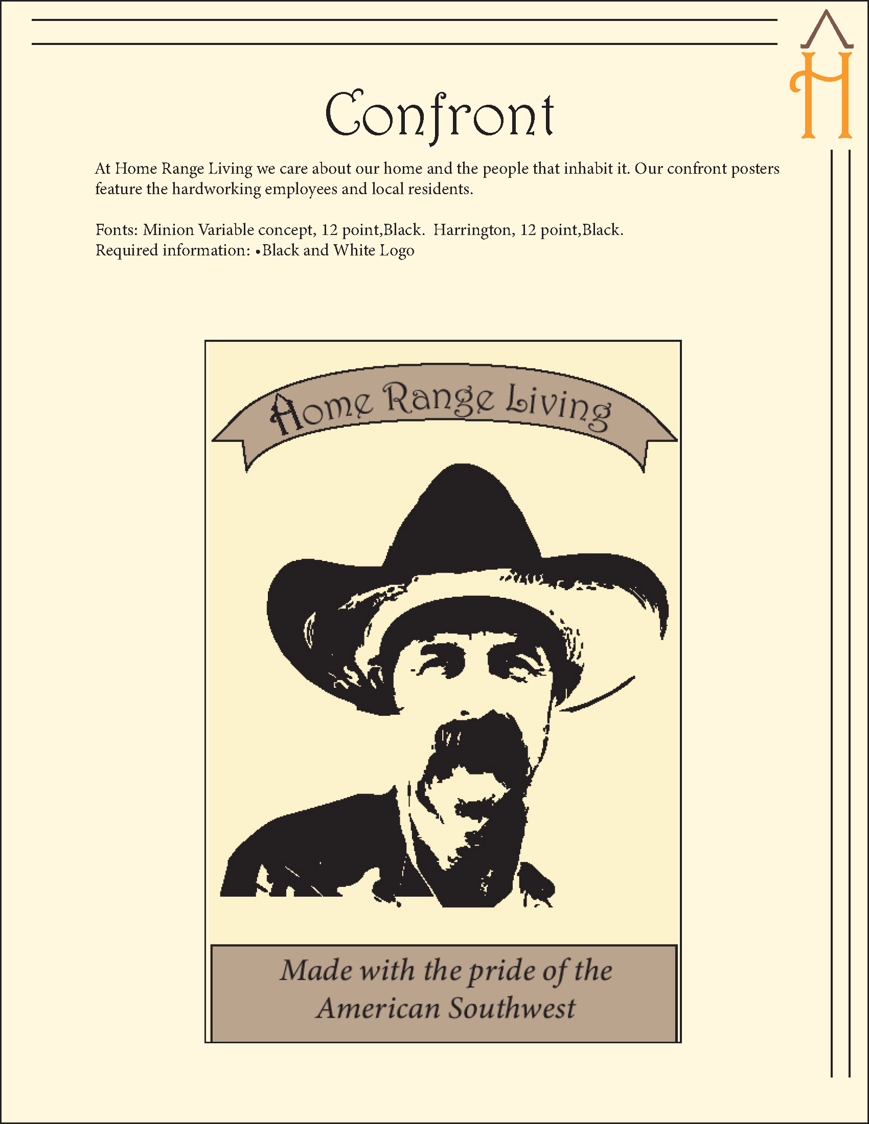
This section had some additional requirements. We were randomly assigned a poster style to use in 3-5 posters to confront our "customers" to a cause or concern of choice. I was assigned "Floating Heads" which worked out very well as my cause or concern was that of the freedoms of the Native American and working women communities in the 1970's and being proud of one's identity and heritage. The last poster of the rancher was not to exclude or isolate the third population of folks who work to bring us food and other items that are produced on ranches with the majority of this community being men.
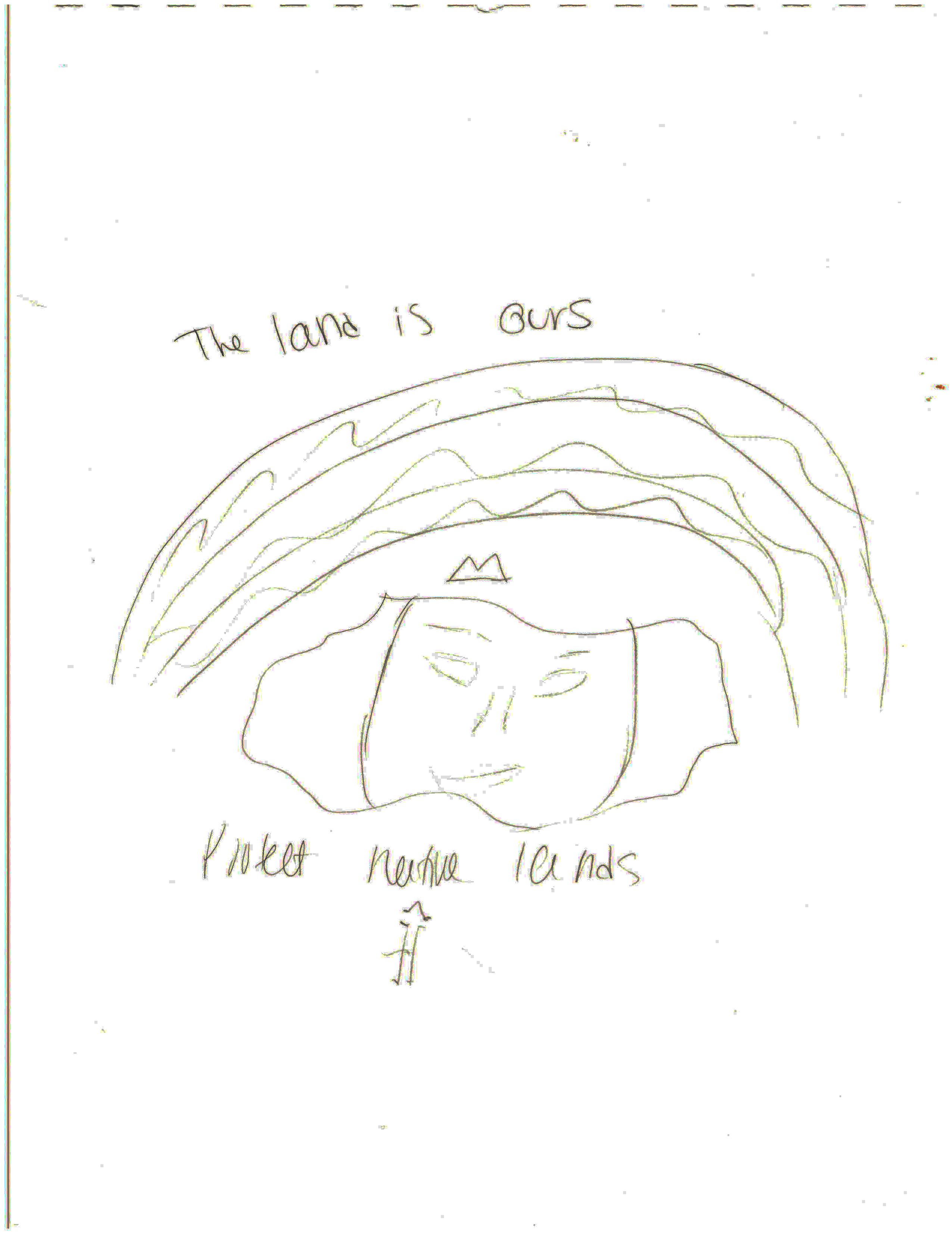
Initial ideas for Confront poster

Initial ideas for Confront poster
Final confront poster 1
Final confront poster 2

Final confront poster 3
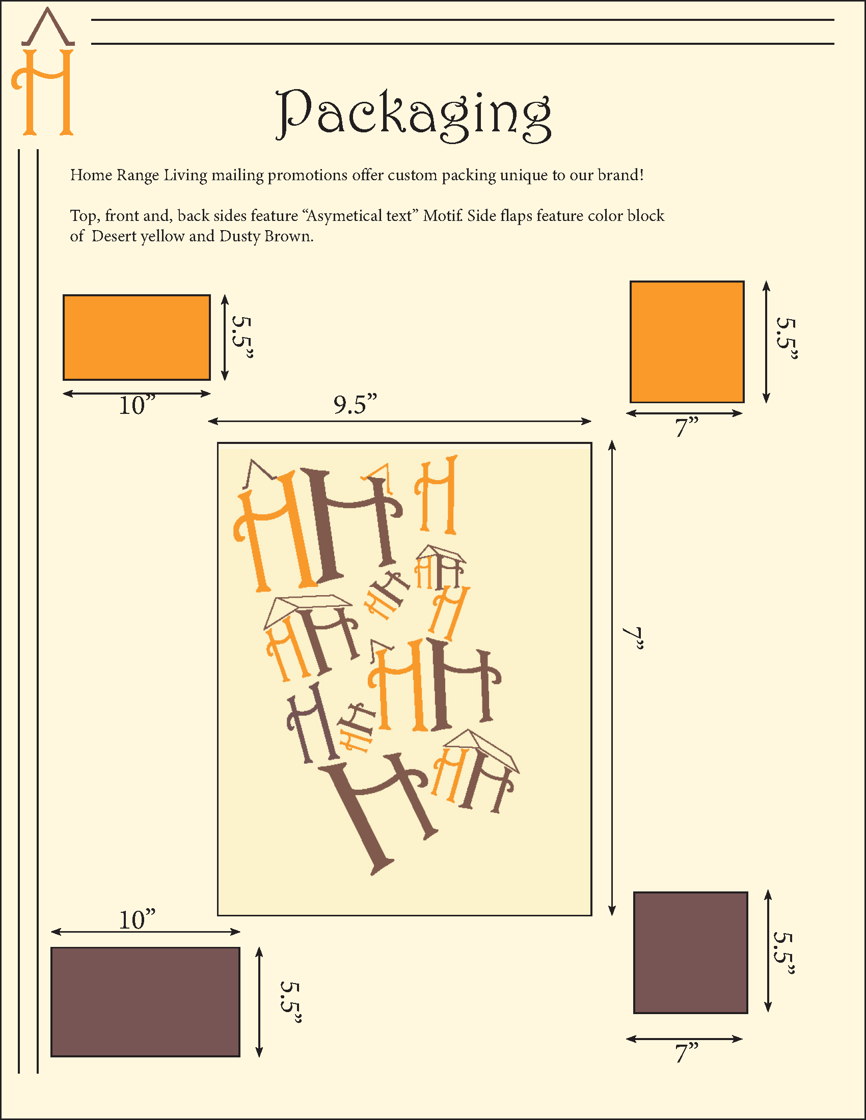
Following the previous section, we were given another random design principal to follow while creating a 3-D product to provide to our customers while creating a lasting visual impression. I was assigned "Asymmetrical Text" and choose to create a mail order bird house assembly kit. I used the asymmetrical text in the packaging design to create a customized box that the birdhouse assembly kit (including all the supplies and assembly instructions ) would arrive in. I wanted the branding to be less intrusive and more subtle as my goal with this box was to focus on the idea of creation rather than plastering that it is a branded item.
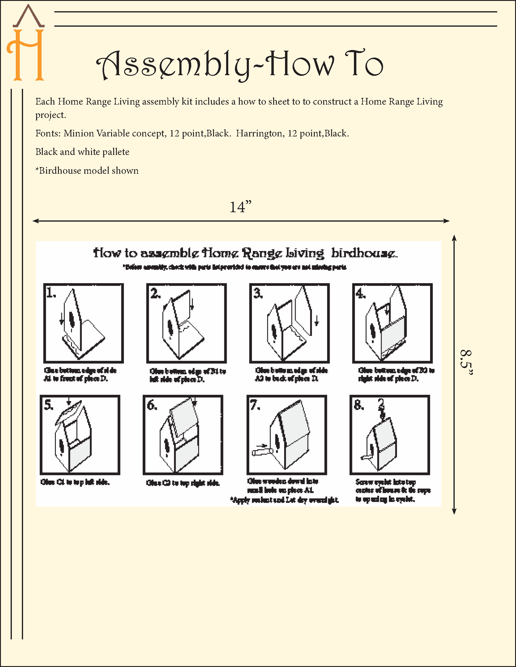
I choose a birdhouse as I liked the idea that it mirrored the idea of building furniture on a simplier level. In addition, I liked the idea that the target demographic of seniors, could "order" this free kit and build it with a child or grandchild to create a deeper imprint with the company providing the opportunity to create a lasting memory. Fun fact: I created the "parts" from scratch using the isometric grid view in Illustrator.
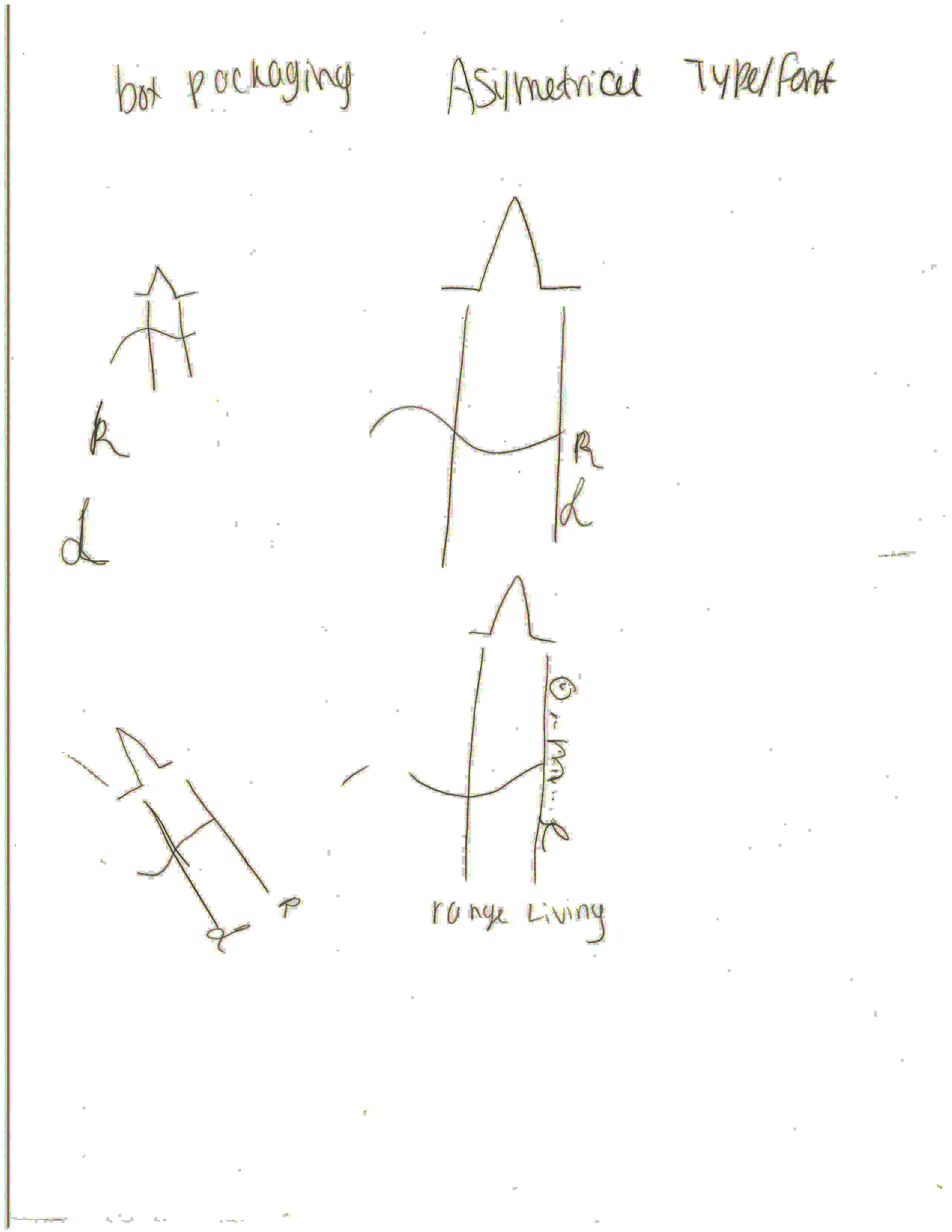
Initial ideas for packaging design
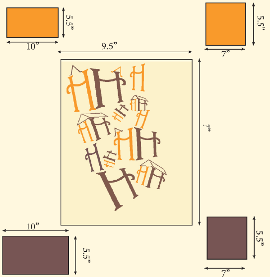
Digital concept for custom branding box.

Concept for part list and instructions

Digital birdhouse parts list

Concept for birdhouse assembly steps and diagram
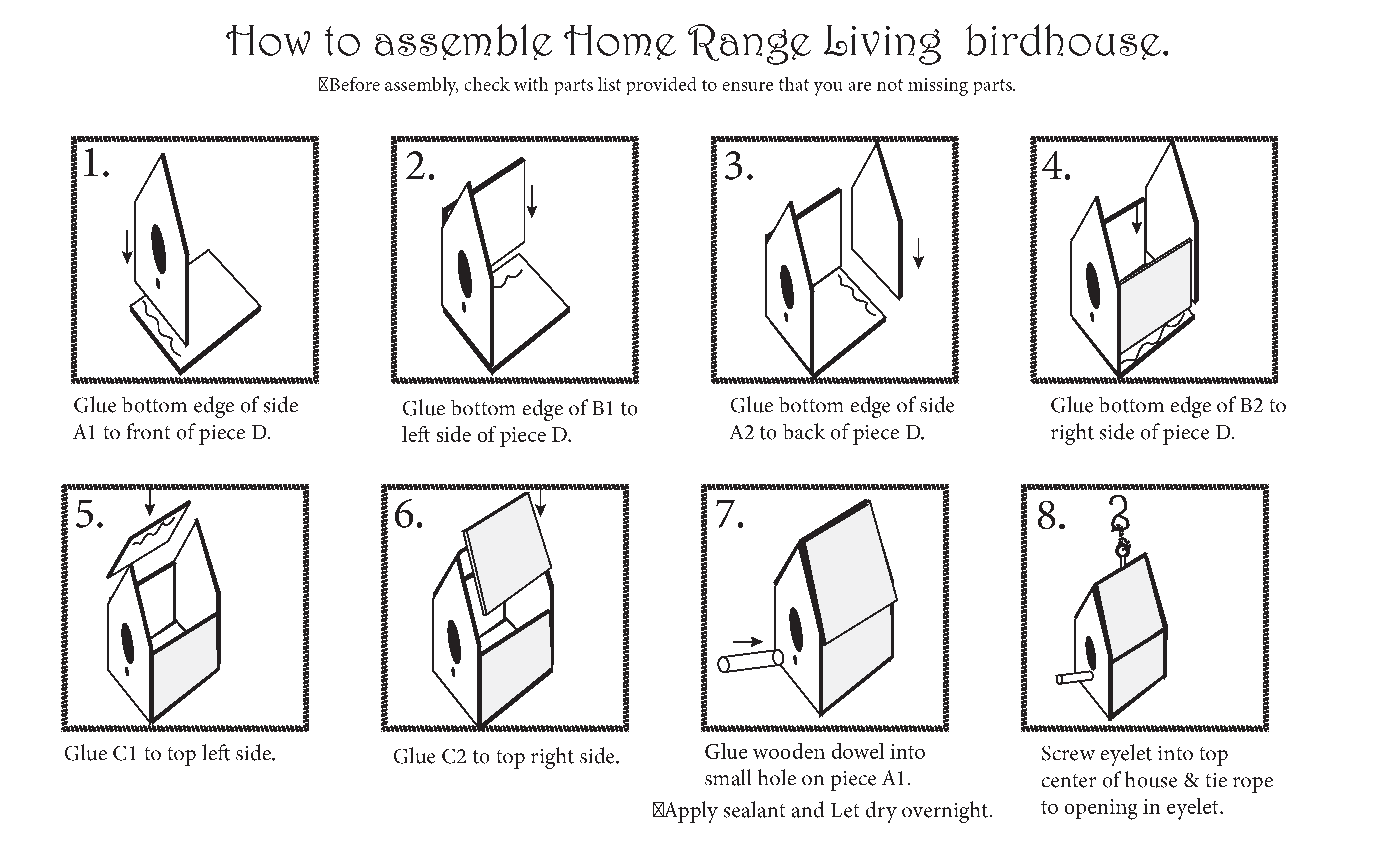
Digital birdhouse assembly steps and diagram